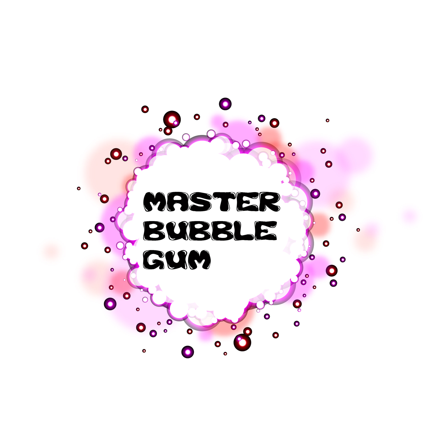
It's not your typical bubble gum imagery and that's a good thing in this case. It works well!
The only minor suggestion I have is that you try centering the type and give the type an 'inflated' look. I'm suggesting that because the flat/horizontal type tends to flatten the bubble look. Also try using various shades or tints of pinks for the type color. The Black type may be a bit harsh?
Don't forget this has to be, when finished, as per the specs, an Illustrator file.
This comment has been removed by the author.
ReplyDeleteHi Fujia
ReplyDeleteThat image looks really cool! Nice work.
It's not your typical bubble gum imagery and that's a good thing in this case. It works well!
The only minor suggestion I have is that you try centering the type and give the type an 'inflated' look. I'm suggesting that because the flat/horizontal type tends to flatten the bubble look. Also try using various shades or tints of pinks for the type color. The Black type may be a bit harsh?
Don't forget this has to be, when finished, as per the specs, an Illustrator file.
Cheers.
-Gord Frazer-